|
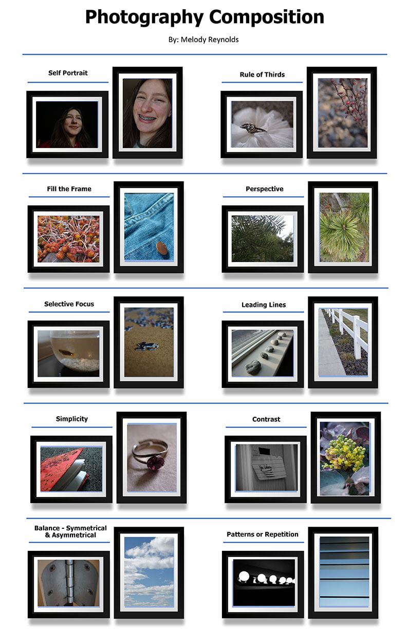
Photography
Movie Poster
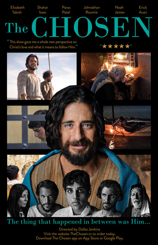
“I began my poster by first sketching out ideas for different layouts and topics that I could use in my design. After choosing a final topic to make an informational poster on (in my case a television show), I proceeded to collect all the images I would be using for my design. The next step involved quite a lot of masking of those images using Photoshop. I decided to take these images and lay them out in a similar design to what I had seen for another film’s informational poster. I felt rather stuck, and not quite sure whether my idea would actually work or not with the limited material available to me in the way of information and images. However, I did some more research and had a talk with my teacher. She helped me pull my original ideas together, and with a little boost of inspiration from her I was able to compile the rest of the elements rather efficiently. After this it was just a matter of using my critical eye, what I’ve learned, and critiques from others to improve the small details.”
|
PGSF Poster Contest
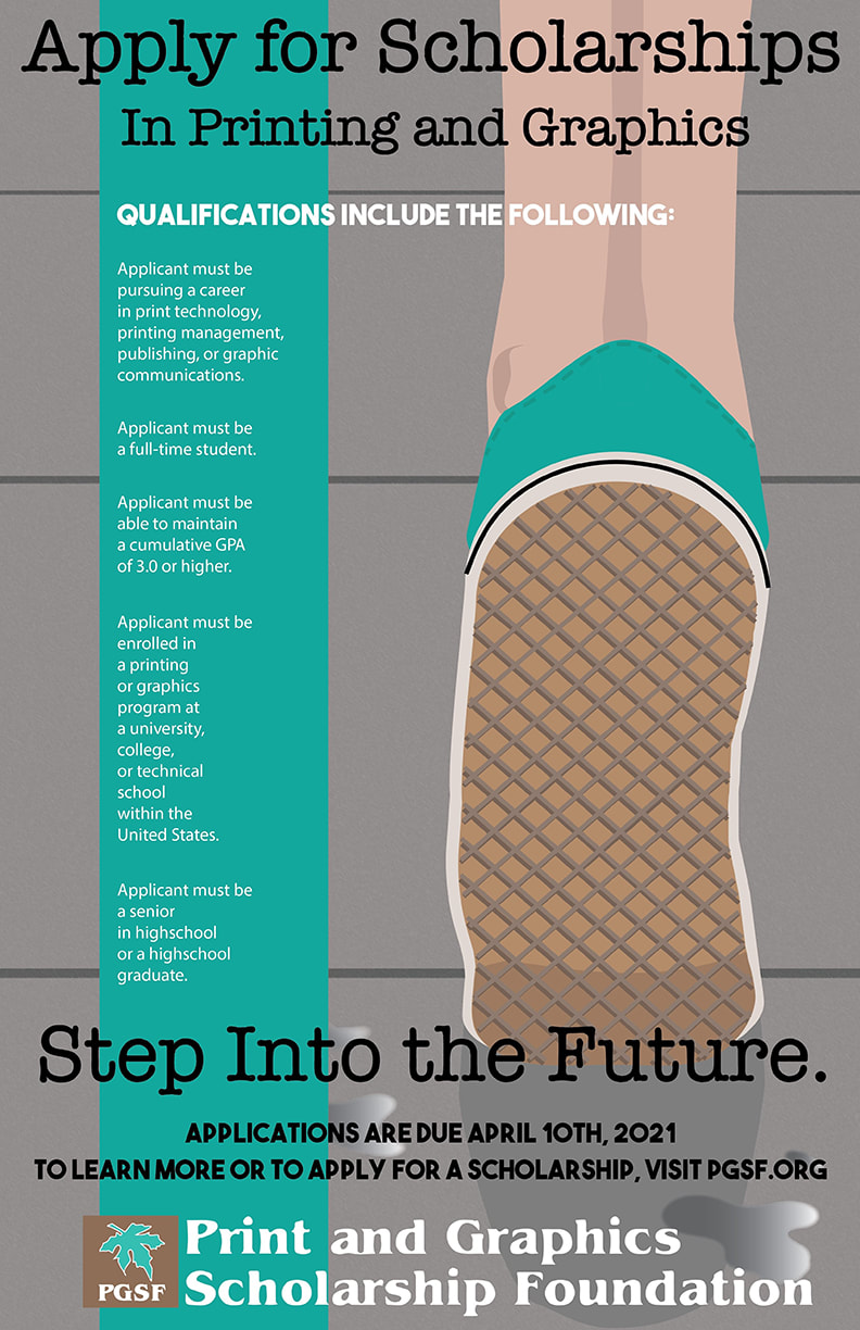
To begin, I gathered 30 images from the internet of previous PGSF posters, as well as other art-related designs. I used these images, along with my imagination, as inspirations for 6 sketches of various ideas for my own design. After consulting with my teacher, I settled on a single sketch.
I then began to build the focal point image of my design using shapes. I chose what colors I would use for this image and began building the environment around the focal point. Throughout the process, I made an effort to add details that made my design more engaging and followed the principles of design. I used my focal point image and the colors I had chosen for it to create a mood board and chose what text font I thought would best fit the atmosphere of the design, supported readability, and looked professional. After I incorporated the text in my design, I asked my teacher for feedback on what she thought should be changed. I used her suggestions and help to add, remove, and modify elements that ultimately made my design more professional, aesthetically pleasing, and complete. With the adjustment of last details, my design is now complete, and I hope others find pleasure in my work. |
VizzComm Poster Contest
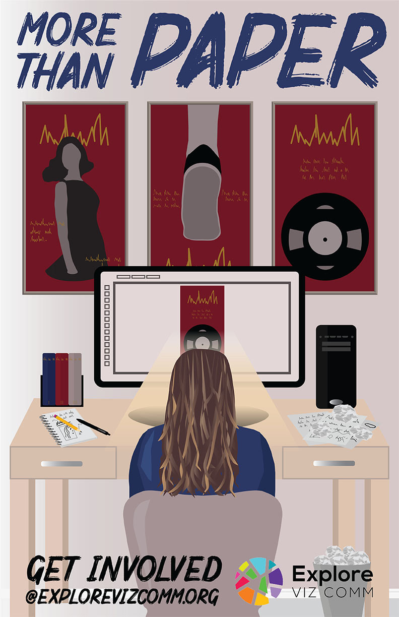
This project could very well have been my most difficult one yet. I started off by brainstorming with a friend. We made a list of different objects or themes that could be likened to the headline choices given for the project. I also sketched around a bit, trying to stir up some ideas and inspiration in my head. I narrowed the list down to the themes I liked the most and gathered images for them. After this, I made more sketches of ideas. After consulting with my instructor, I directed my energy to developing the most favorable ideas or ones that were not very detailed. I eliminated ideas and decided on a final design. Not too far into the project, I found myself lost and in need to take a step back. I had a conversation with my instructor that gave me a new focus and more freedom to make changes. It was a long journey of altering several elements to, in the end, make the whole picture. Although the concept was simple for this design, I really wanted to focus on the small details. This pushed me to come up with solutions for problems and to learn new things. I hope my hard work paid off in a design that people can connect with and find something new in every time they look at it.
|
