|
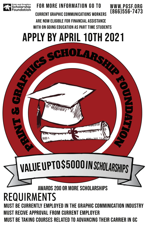
PGSF Poster Contest
Reflection:
The PGSF contest was one of my favorite projects to work on. For I had a few ideas running through my head after searching up images related to this poster. Then sketched out my favorite ideas and creating a mood board after making my decision. Even though it can be a simple thing sometimes. It was picking and choosing the colors I wanted to use. Remembering color theory and trying to make sure that it was even but eye catching. Even though it’s not completely my own original work I feel like this project is one of my best color, detail, and typography wise. So over all I had fun with this project. |
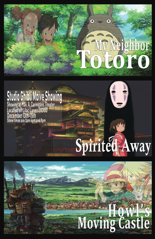
Graphic Design Poster
Reflection:
For this poster we had to create a movie poster with the process of Making. Where I had to pick images and outline while getting ride of the background I didn’t want. While leaning this prosses I had not come up with what I was going to do. So, I practiced a bit more and thought on it. When the idea of a movie marathon poster came into mind. So, I pick three movies that I enjoyed. Found a verity of images I would need and started masking. After masking the specific images for the poster, I arranged them in ways I felt looked good but still made sense when looking at it. All of that was easy in my opinion and I got it done quite fast. With my typography, what text and font I would be using, is what I struggled with. But after asking other students what they thought and asking my instructor for an opinion. I was able to figure it out and make it work with my poster. Making small adjustments along the way. But it still came out well and its one of my favorite posters. |
VizzComm Poster Contest

Reflection
|
