|
Graphic Design Poster
Reflection
|
PGSF Poster Contest
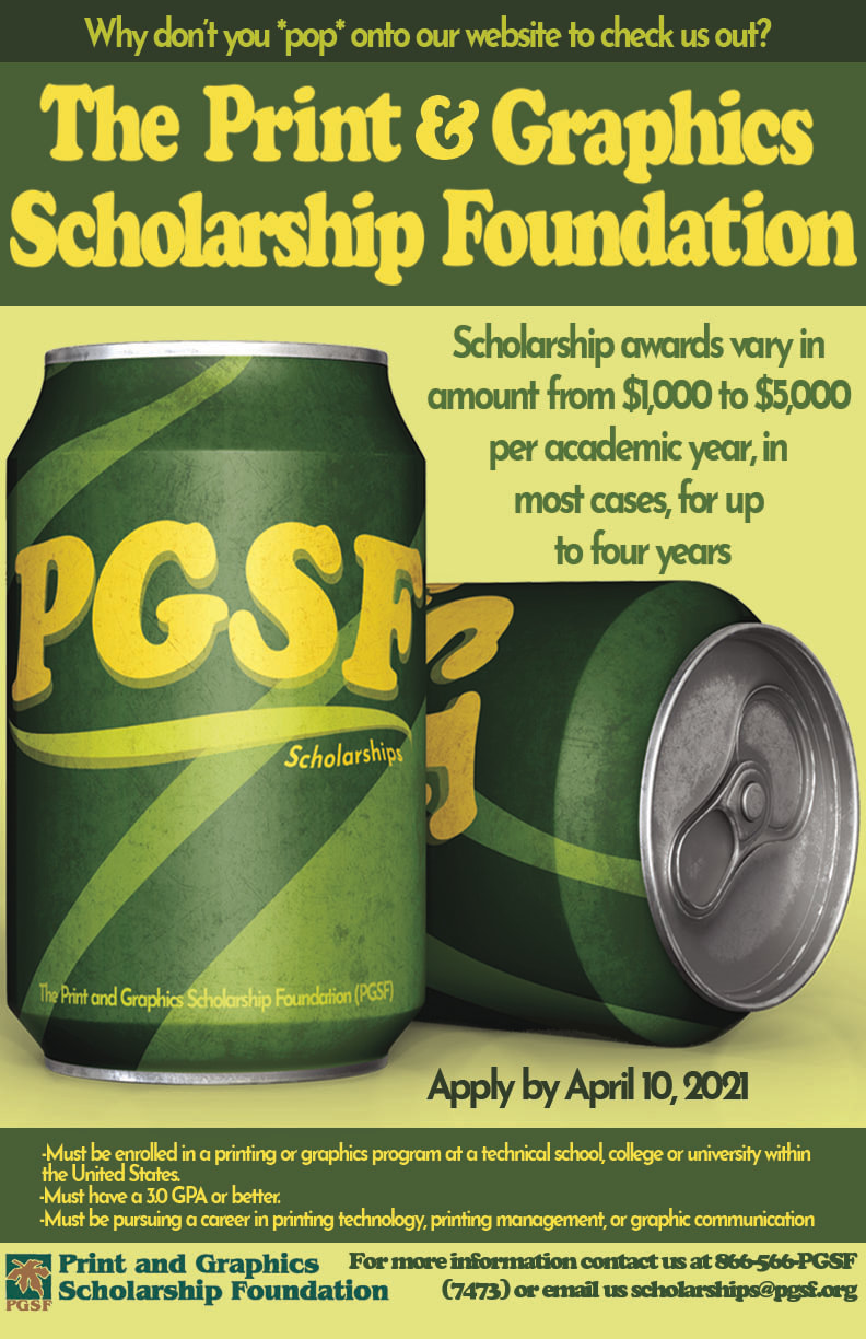
I started this poster with an almost immediate idea of using pop cans as my idea but I had no idea how to relate that back to the poster and it’s message. I started looking for ways to make it fit and I decided on making a pun so the whole image would work together. I then looked up reference images and ideas and after that I sketched my idea and a few other ones I thought might work as well. Then I started working on my poster going with the original idea of using pop cans. I gathered a mockup of some cans, drew the can’s logo and design, then I started working on the colours and the typography. I gathered up all of the required text and a bit more that they wanted on their poster and I carefully laid it all out making sure that the text was readable and clean and big enough for people to see.
|
VizzComm Poster Contest
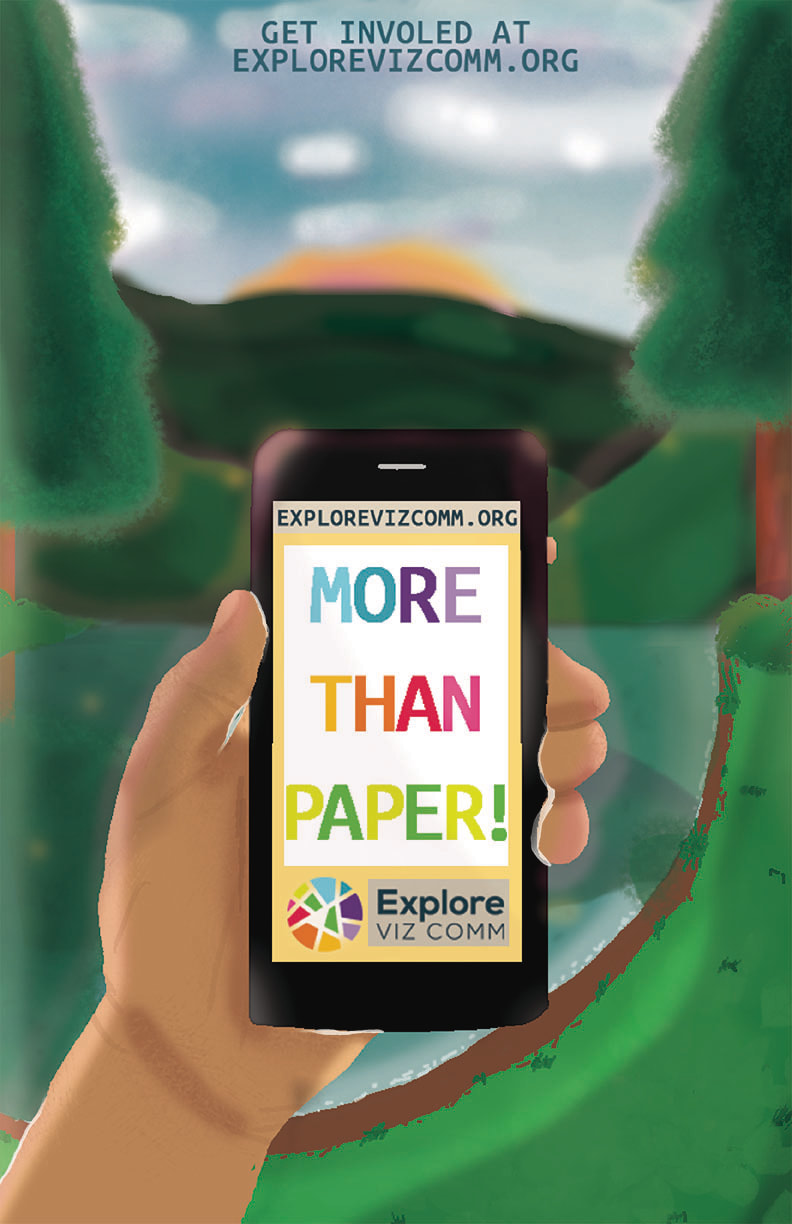
With this design, I started out by getting 30 images and I started thinking of ideas for the poster. I then sketched a simple forest idea with the words, “More Than Paper,” on the top. As if the words were like a banner in the sky above the forest. There was originally a big sunset, but I scraped that idea because I didn’t like how it looked. I then made a mood board, gathering colours, fonts and reference images that I wanted so I could get a rough idea of what the poster would possibly look like. I chose colours that feel and look like a forest, so greens, browns and blues. Then I chose a nice calm but strong font to go along with it. I believe that people would like this design because it’s like ones that have won and also because it a nice and simple design that shows what Explore Viz Comm is
looking for. |
