|
Graphic Design Poster

Reflection:
I started this project to create a design for a phone case. I wanted a blue and green color scheme, so I scrolled through adobe color until I found one I was happy with. After googling images of trees to use as reference, I began using the pen tool to outline the trees shape. I made one leaf and copied it across the design, occasionally resizing the leaf to fit better and add depth to my design. Although it is not one of my longer projects, this one is one of my favorites. |
VizzComm Poster Contest
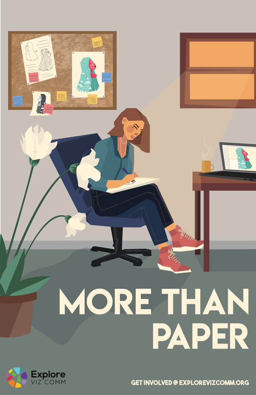
Reflection:
For this design I started by finding images of posters that displayed artistic aspects I wanted to incorporate into my own design. I knew I wanted this design to be more calming and graceful to the eye. As an artist, when I think of paper I think of a blank space for me to fill with whatever I want. It’s a sort of freedom that brings me peace, so I decided I wanted this design to focus on an artist. I searched models to find poses I liked and found soothing color schemes to go along with my design. The fonts I picked out were also more relaxing and loosely written. I sketched out different ways that this design could look before picking the one that I felt best left a comforting, mellow vibe. I sketched it out again, adding details and fixing some spacing issues before finding the final font and color scheme to choose from. Besides some spacing issues I had to fix, this project flowed as smoothly on computer as it did on paper. |
Graphic Design Poster
Reflection
|
