|
Movie Poster
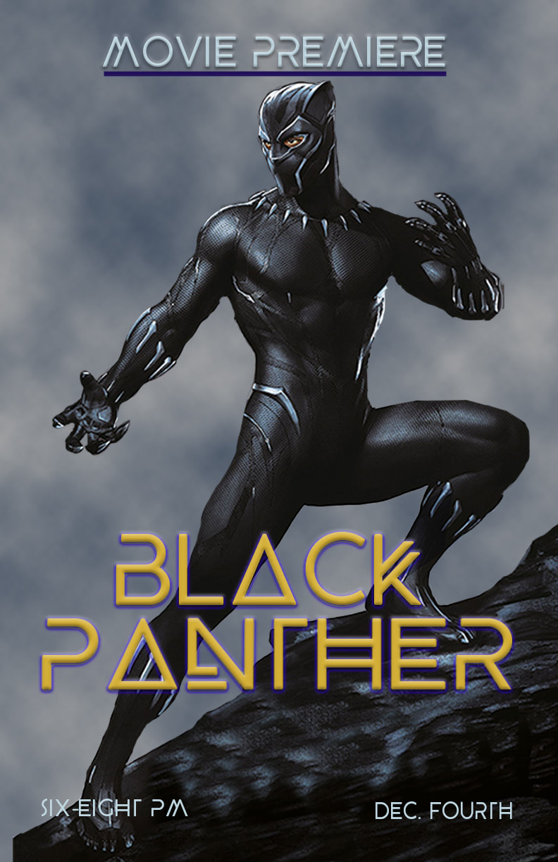
This poster was made for a film festival/movie night, and I feel it makes an excellent example of an appropriate poster. The elements really compliment each other, and I think it can be admired by everyone. I started by adding the Black Panther figure, then masked out the background of the image. I then added a cloud effect for the ACTUAL background, and used the clone stamp tool to make the rock he’s standing on a bit more natural. From there, I added the text in front of the masked black panther image, and…that’s it.
|
PGSF Poster Contest
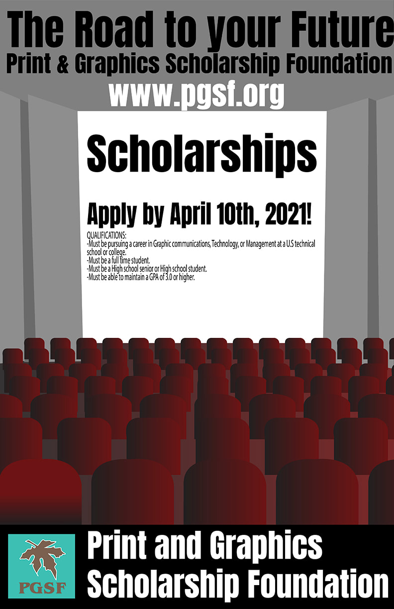
The process behind my PGSF (Print and Graphics Scholarship Foundation) poster was relatively simple. I put in an image of a movie theater and rows of theater seats, traced over them. From there, I added text on the screen, above the screen, and below it. On the bottom, I put an image of the PGSF logo, and did an image trace for it. The rest of the design was just putting in gradients on the theater seats, which would quite literally serves as the only real color in the poster.
|
VizzComm Poster Contest
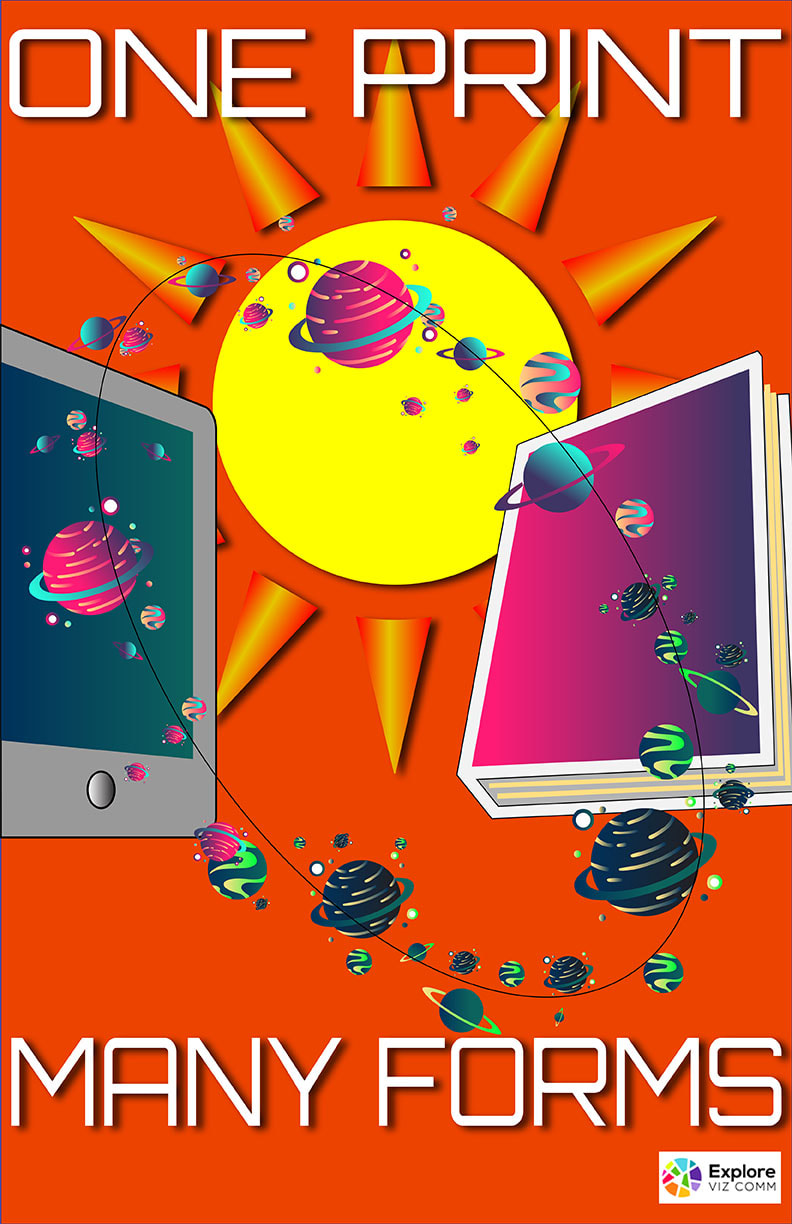
When I started this project, I got most of my progress done in a few days. I first started by finding a tablet image, which I then traced. From there, I added a book which I traced as well. After that, I placed several images which were a pain to deal with, as I had to redo some of them. For the record, the planets were not the only ‘annoying’ things to do. I went through several iterations for the text, finally settling on Orbitron with a white fill and no stroke. I then put in an ellipse that would serve as an orbit of sorts for the planets to, well, orbit around. Afterwards, I colored in the planets, tablet, and book, and duplicated the planets and made them different sizes and colors. I proceeded to add a sun image, image traced it, and added a gradient to the outer triangles. From there, I added a orange background, added the Vizcomm logo, and that was the end of the project.
|
